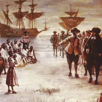
Photo By:
Unknown
Photo Taken: Durning the 1440s
Subject’s Expression:
The subjects (likely enslaved individuals or traders) appear tense and fearful, reflecting the gravity of the historical moment. The facial expressions and body language evoke distress, capturing the human impact of the trade.
Quality of Light:
The lighting is likely dramatic, highlighting certain figures or elements (like chains or ships) while casting other areas in shadow. This adds emotional weight and emphasizes the severity of the situation.
Rule of Thirds:
The photographer or artist may have positioned the main figures off-center, creating visual interest while also leaving space to depict surrounding activity (e.g., guards, ships, or crowded decks)
Why I chose this image:
I picked this image because of the dramatic use of light and shadow, which created a sense of depth and highlighted the suffering of the individuals. I could see that the lines of the ship’s masts and ropes naturally drew my eye toward the figures, making the composition feel intentional and powerful. The textures of the chains, wooden planks, and clothing added a tactile sense of harshness that I could almost feel, which made the image emotionally striking.

Photo By:
John Vachon
Photo Taken: April 1938
Obvious Main Subject / Image Area:
I chose this photo because the main subject—the drinking fountain—is prominent but doesn’t completely dominate the frame. This allows the surrounding area to provide context, illustrating that segregation was a normalized part of public spaces.
Keep It Simple:
I selected this image because it is visually simple. The uncluttered composition emphasizes the label on the fountain without distractions, making the social commentary clear and powerful.
In or Out of Focus:
I picked this photo because the fountain and the “COLORED” label are sharply in focus, ensuring that viewers immediately understand the central message. The background is less distinct, keeping attention on the main subject.
Why I chose this image:
I picked this photo because the background, concrete walls, ground, and simple surroundings, does not distract from the subject. Instead, it complements the fountain, reinforcing the sense of institutionalized segregation and public placement.

Photo by:
Rachel Rausch
Photo Taken: September 11, 2025
Subject’s Expression
The 1951 Chevrolet Deluxe, with its sleek lines and vintage charm, evokes a sense of nostalgia and freedom. The car's design suggests a time when driving was an experience to be savored, reflecting the joy and liberation associated with summer road trips.
Quality of Light:
Assuming the photograph captures the car in natural daylight, the lighting would highlight its polished chrome details and smooth curves. Soft, diffused light would enhance the car's features, creating a warm and inviting atmosphere that complements the summer theme.
Rule of Thirds:
Positioning the car slightly off-center within the frame would adhere to the rule of thirds, drawing the viewer's eye across the image. This composition technique adds balance and interest, leading the eye from the car to the surrounding summer landscape.
Why did I chose this image:
I chose this image because the 1951 Chevrolet Deluxe immediately evokes a sense of nostalgia and the joy of summer driving. I was drawn to how the car’s polished chrome and smooth lines stand out in the composition, making it the clear focal point while also giving a glimpse into the era it represents. The way the light reflects off the car and the subtle shadows around it adds depth and realism, making me feel like I could almost step into the scene. Additionally, the background complements the car perfectly, suggesting open roads and freedom without distracting from the main subject. Overall, the image captures both the beauty of the vehicle and the feeling of carefree summer adventure, which is why I selected it.

Extra Credit Photo
Photo By: Kayla Peterkin
Photo Taken: 10-06-2025
Contrast Appropriate
There’s a strong contrast between the moon’s golden light and the deep shadows below, which makes the moon pop visually. The balance between light and darkness feels intentional and dramatic.
Use of Shadows
The lower part of the image — with cars and trees in shadow — adds a sense of mystery and grounding. It makes the moon appear even brighter and more distant, amplifying the feeling of depth.
Background Compliments or Detracts
The silhouettes of trees, power lines, and distant buildings subtly frame the scene without distracting from it. They add context and realism while maintaining focus on the moon’s beauty.
Why I chose this image
I chose this image because it captures a quiet, almost magical moment that made me pause and breathe. The way the moon glows above the dark parking lot feels peaceful yet powerful — a reminder that beauty can appear in ordinary places. I love how simple the photo is, yet it carries so much emotion through light and contrast. When I look at it, I feel grounded and calm, like the world slowed down just for that moment.


Comments
Post a Comment